Over here at Marketing Queen, we fangirl hard for the Elementor WordPress builder. We’re big (read it: huge) on empowering our clients to be able to update their websites themselves—and Elementor makes it super easy to do it! That’s why we build 99% of our clients’ websites using this WordPress builder. And, we provide training to all of our clients so they don’t feel intimidated at all!
Elementor means you don’t have to know code to make changes to your site. That’s right! You can add advanced styling, layout, and design elements to your WordPress content using the Elementor interface. It really is that easy.
We’re not the only fans of Elementor! Elementor was born in 2016 and already, it’s set an industry standard for page builders. It has an impressive rating of 4.8 on WordPress.org.
We strongly recommend that you choose a designer who builds on Elementor. If you need more reasons why, keep reading!
Prediction: Elementor Pro Page Builder will still be around in 5+ years
Unfortunately, many WordPress themes and builders come and go. My clients have come to me with WordPress builders that don’t even exist anymore. (Thank goodness they decided to redo their websites!) Or, they still exist, but they’re no longer being supported or updated, which makes your website vulnerable to spam or even hackers.
You want your brand-new WordPress website to last you for at least five years (if not longer). Elementor is designed for the future. Its creators update it frequently and their support desk is extremely responsive.
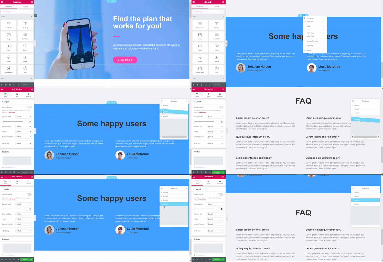
The back-end of Elementor Page Editor is so dang visually appealing
This is no booty joke! The back-end of a website is where you add blog posts and update the pages of your website. (Note: Marketing Queen uses the Elementor builder for WordPress PAGES and not blog posts.)
Some builders have ugly interfaces that feel clunky to use. But Elementor’s clean, simple design makes it feel easy to use. Most of my clients ENJOY getting to update their websites because it’s so pretty.
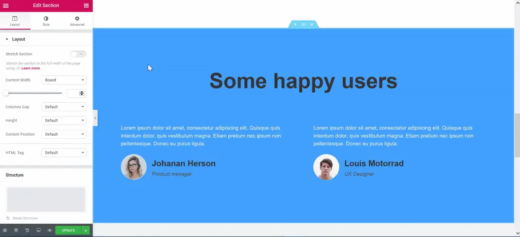
You can see your design changes in REAL TIME
Other builders require you to make your changes, save them, and then load a preview of what it will look like on the live site. It’s a clunky and time-consuming way to see if you like the look of the changes you’ve made.
Even worse, some builders require you to hunt down your widget on the backend before you can change the text inside them.
Elementor does not require these extra steps! See this short video below to see what I mean.
Because you’re making changes on the front end, you can see your design changes as you’re making them! If you don’t like them, you can just undo them. Control-Z (or Command-Z) works, my friends!
Elementor really does make it that easy. You’ll save so many clicks because you can see immediately whether you like something or not.
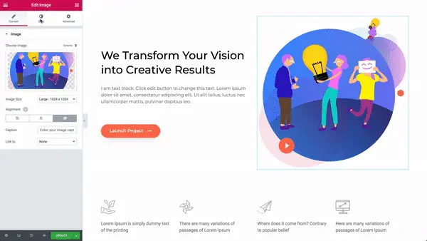
Elementor Pro page builder makes it easy to add things like testimonials, photos, and many many specialty widgets
Elementor is a page builder, and widgets are the building blocks. That means you don’t ever have to touch website code if you want to add text and photos to your website. Instead, you can drag and drop in “widgets” that make it easy to add testimonials, photos, and fun elements to a page.
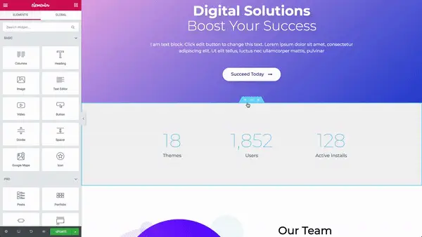
Everything can be customized. E V E R Y T H I N G.
It never ceases to amaze me how Elementor lets you customize even the smallest details of each widget, each column, and each section/row on a page.
Want to change the padding on a section? You can manually set it to whatever you want…for each device! More for desktop? Sure. Less for mobile? Okay. Want to adjust the column widths? Just drag the divider between the columns.
But it’s not just the elements on a page! Remember, I said you have control over EVERYTHING. You can even tweak the way text looks. Want to make your font bold, italic, or underlined? Pssssh. Elementor pushes those boundaries and will even let you animate your words. Need a little drama? Change your letter spacing and line-height. There are even “blend” modes where you can alter the luminosity, lightness, and darkness of your font.
That’s a serious amount of control. It’s Janet Jackson level!
Related: Don’t Forget to Put These 5 Important Pages on Your Website (Plus a Fun Bonus Page
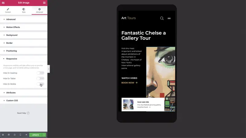
Elementor Page Builder was made to be responsive
In the year 2020, websites have to be responsive, meaning they need to adapt to any screen size that’s accessing them. Whether someone is looking at your website from an iPad, iPhone, an ordinary laptop or a giant desktop computer screen—it has to be functional and look amazing.
Elementor is responsive by default. Meaning, your site will look good by default. But let’s say you want to tweak how a site appears on an iPad versus a laptop. Remember how I said everything is customizable? This is true for responsiveness too. You can make changes to how your site looks on mobile and only mobile. Those changes will not be carried over to desktop. It’s truly mind-blowing.
And, you can check to see what all of it will look like on different devices from right inside the editor. You don’t need to borrow your friends’ devices just to see how it will look. It’s all right there for you.
Did you fall in love with Elementor Website Builder too?
Tl;dr We think Elementor is the bee’s knees—and we hope you think so too! When you’re auditioning WordPress website designers for your new website, be sure to ask them if they build with Elementor.
Interested in learning more? I suggest watching a few of Elementor’s videos on Youtube to see the builder in action and to get ideas of what you might want to build on your site.
Gif images in this post are from Elementor.
