


Bonnie Tyler isn’t the only one who needs a hero (see reference for a fun distraction – but be sure to come back). Your website pages and blog posts also need a hero! A hero image that is.
Hero images tend to be the largest images on your site. Because they appear at the top of the page, they set the tone for the page and its content. The homepage hero image is your reader’s first impression of your website and your business. So you want to be intentional about how you choose the right one.
The right image is only the beginning though. You need to optimize its layout and position on the page.
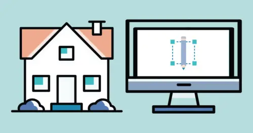
If you’re using the Elementor builder for WordPress, you’re already ahead of the game. Elementor has excellent layout options to help you design your pages. So here’s everything else you need to know.
What’s a hero image?
The hero image is the banner image at the top of the page (or post). It typically spans the width of your page and it often takes up at least half of your site visitor’s screen in height.
Let’s say we’re talking about a blog post. When your visitor arrives, they’ll see two things: the name of your post, and the hero image. (Many times this matches your Featured Image.) That’s your first impression right there! The hero image shouldn’t just relate to the topic and message of the post, it should enhance it. I’ll give you an example.
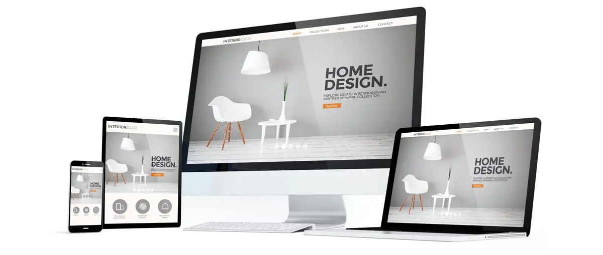
Photo from Adobe – georgejmclittle
Related: Don’t Forget to Put These Five Pages on Your Website (Plus a Fun Bonus Page)
Choosing the right hero image
Maybe you’ve written a blog post about do’s and don’ts for centerpieces at a wedding reception. Your hero image obviously needs to have flowers in it, and not fans at a hockey game (or something else that’s unrelated). But not just any flower photos. Wild flowers in a field won’t work. Neither will a bride holding a bouquet (close, but no cigar). Instead you’ll want beautifully curated floral arrangements adorning a formal tablescape. Or maybe a florist putting together one such arrangement. Or you could even use a photo of wedding guests eating dinner with a stellar centerpiece at the center of the table.
You also want to make sure the image quality is high. No iPhone 6 selfies, please! You want a high resolution photo that’s not blurry. But more importantly, you want professional photos because it lets your site visitor know that you’re a professional.
We highly recommend styled shoots and working with a brand photographer to create the photos that appear on your website pages (Home, About Us, etc.).
In short, your hero image is very important. Choose it wisely!
Making sure your hero image is the right size (pixels, compression, and dimensions)
We covered a lot of this in our blog post about image best practice for your website. We encourage you to read that post to learn everything you need to know about using images throughout your website, not just the hero image!
Pixels, compression, and dimensions are all important for making sure your image looks great across a variety of different screen sizes.
Get your Pixels in Order
First, you want the Goldilocks amount of pixels: not too few, not too many, but just right. What’s the right amount of pixels?
Typically, the largest screen size your readers will use is 1920 pixels in width. You don’t need more than 2,000 pixels. For blog posts and most website layouts, images of 1,000 or 1200 pixels are just right.
Too few pixels means your images will either be too small to see, or if the layout is set to stretch the image, it will be blurry. Too many pixels, on the other hand, will make your site pages slow to load. Your site visitors are lovely people, but they’re not going to wait around for an image to load. They’ll bounce off that page faster than LeBron James dribbles a basketball!
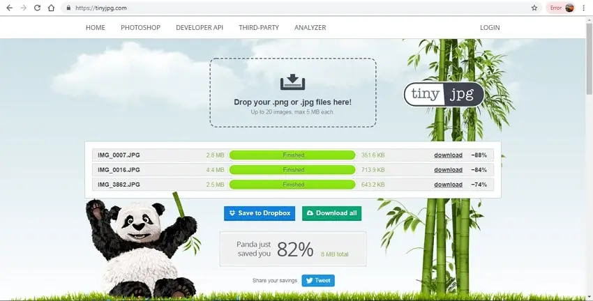
Compress For Speed
Compressing your images helps with file size too. Online apps like https://compressjpeg.com/ or https://tinyjpg.com/ can reduce the size of your file without compromising quality. Smaller files load faster. Any image more than 1MB is too big, period dot. The goal is to have images that look great but are less than 250kb in weight. Be sure to resize the dimensions of the photo before you compress things.
Orientation Matters
Another component to choosing the right image, is looking at its orientation. Most times, hero images need to be in landscape orientation (horizontal) so they stretch across the desktop view fully. Portrait orientation (vertical) can either be too tall and lead to scrolling for days, or else feel less important if the image is made smaller than full-width.
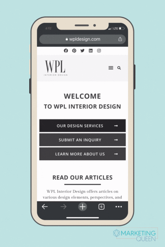
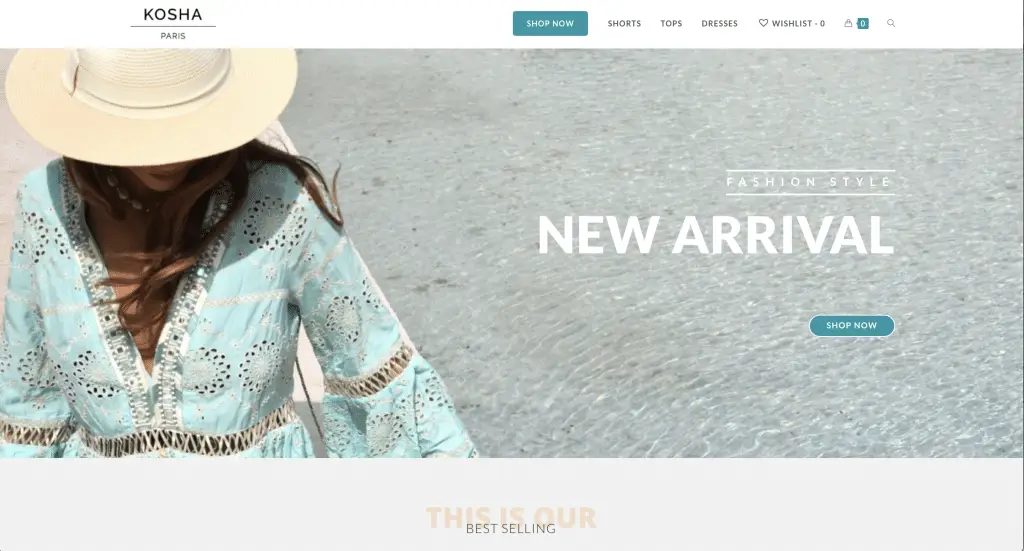
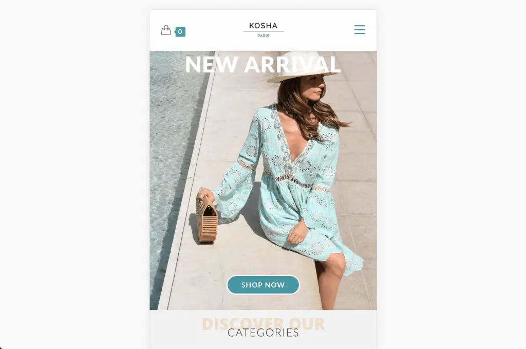
TIP: If you use Elementor (we love it!), you can even use a different image as your hero for desktop display vs mobile displays. This is a great place to use both a landscape image and a portrait image depending on the device. Here’s an example:
DESKTOP
MOBILE
Cropping, Overlays, and Text – oh my!
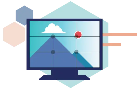
Sure, orientation helps your image look great in the overall layout of your page. But there are more ways to make it look just right! It all starts with a Focal Point.
Have you heard of the Rule of Thirds when it comes to photography? We want to apply that here, too! Most times, your focal point will want to be center center within the frame. This helps the photo to be adaptive and cropped easily on various social media sites. Keeping the point of interest in the middle will usually preserve the important parts of the image.
If you want to see text boxes on images, you may choose to have a photo with a focal point in the left third and then place the text box in the right third. An overlay is also a helpful way to make text visible atop a photo – just be sure your font and colors are bold and truly legible. Otherwise your site visitors will struggle to read the words on the image, which will detract from the professionalism of your brand.
Ready, Set, Publish!
Your image is perfectly sized, positioned, and laid out – so go ahead and hit publish on that blog post. Bonnie Tyler will be so proud that you found a hero!
Don’t forget to zoom out and look at the webpage as a whole too. Do the photos throughout all of your pages look like a good collage or mood board for your brand? Do they tell a cohesive story about your brand’s content? And lastly, does it all fit together for your audience?
If you need help creating everlasting first impressions through your website imagery…we’re here to help. Get in touch with us via our Contact Page and we’ll get started!