

When it comes to branding design, most people know to focus on these basics: choosing a logo, color scheme, imagery, etc. One often-overlooked part of branding and design is typography, which is about how text (or type) is designed. Actually, what you’re reading right now is typography.
Today, we’re going to show you all the font basics you need to know to start incorporating gorgeous typography for your brand.
Elements of typography
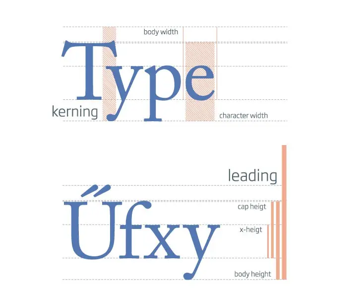
First things first, let’s define what exactly we’re talking about when we say “typography” and “font basics”. There are 6 essential elements that go into designing type…
- Typeface: Typeface and fonts are often confused with each other. A typeface is basically a family of fonts, or fonts that are in the same design family. It’s a group of letters, numbers, and symbols that all go together stylistically.
- Font: On the other hand, a font is a character set of a typeface, with a specific size, weight, and style.
- Line length: This is about how much space a line of text takes up between the left and right margins of that line
- Leading is about the space between lines of text (aka the space between the bottom of one line of text and the line of text above or below it)
- Kerning refers to the size of white space in between individual characters.
- Tracking is about uniformly increasing or decreasing the horizontal spacing across a line of text
Why does typography matter?
Selecting typography (especially for your brand) isn’t simply about creating a cool visual aesthetic.
If anything, this is a super duper important part of your brand because it’s one of the main ways you will be communicating essential information (product/service details, your background, experience, contact info, etc.) with your audience. They have to be able read what you have written!
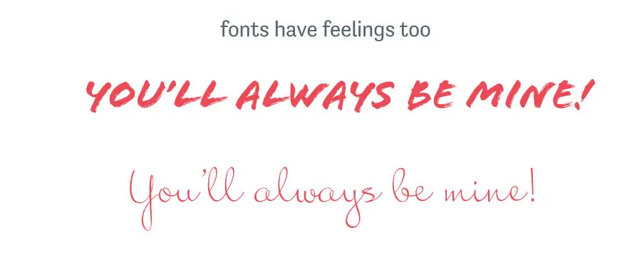
Plus, typography is psychological, too. Text appearance actually affects people’s emotions and mental associations. Think of text that is extremely small and hard to read, or a font that is so ornate it’s hard to decipher. This will not make your audience happy! Even if they do understand what you’re trying to say, they’ll leave your website frustrated they had to work so hard for the information. And, your brand will appear less professional and polished. Unfortunately, this is what people will remember about their experience with your website (versus remembering the amazing products and/or services you offer).
Let’s cover the font basics
Now, to start designing your brand’s typography, you have to start with fonts. The typefaces and fonts you choose will help you decide on the other typography elements we talked about.
Font types
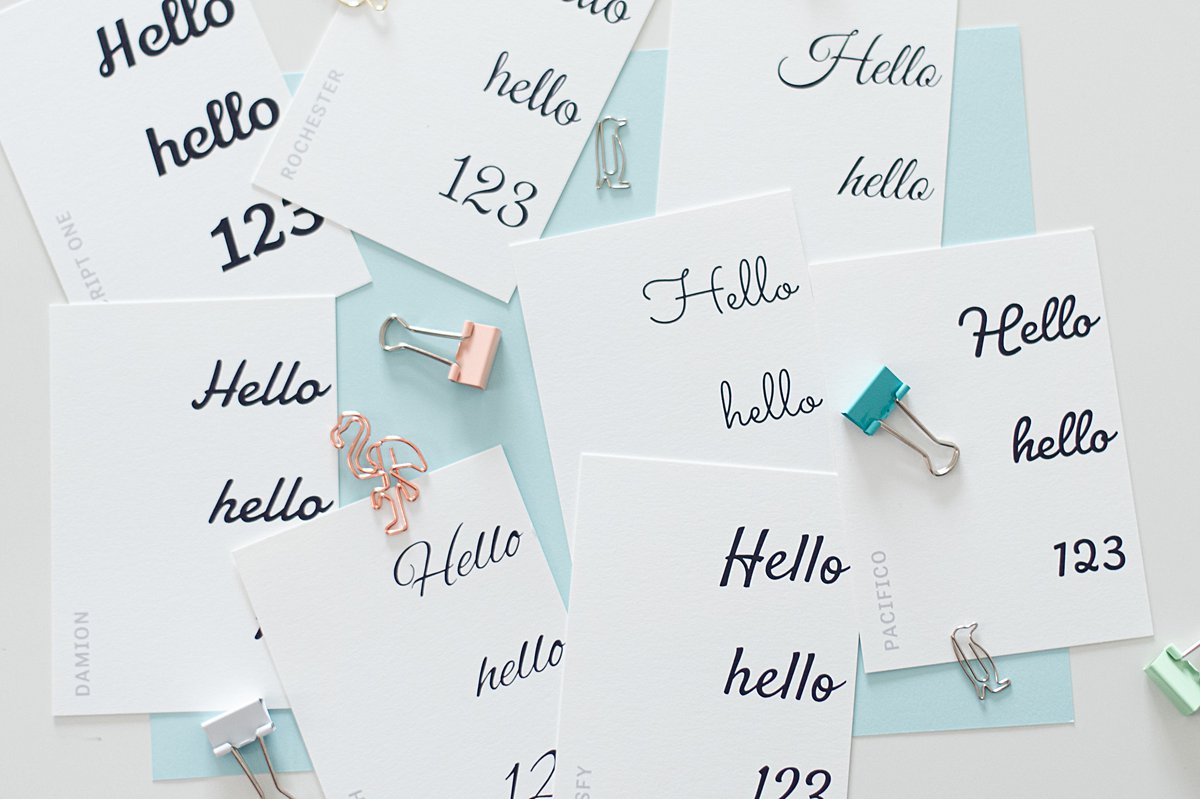
One of the most important font basics to know about is the different font types and subtypes.
First, there are Serif fonts. These are some of the oldest, most classic fonts around. They have little features, or markers, at the end of their letters, almost like little feet. (Think Times New Roman.)
Slab serif is a popular Serif font subtype. These fonts are characterized by their thick, bolded features.
Second, we have Sans Serif fonts. Sans = without. Sans Serif = without Serif. Basically, Sans Serif fonts don’t have those little feet that Serif fonts have. Rather, they’re all about those simple, straight lines!
Finally, Script fonts mimic hand-lettering. They are typically made with more fluid strokes and can vary a lot, just like how actual handwriting can vary from person to person! Some of these fonts are more formal cursive or calligraphy styles, while others are more casual, hand-lettering styles.
Plus, there are decorative fonts! The name says it all: these fonts are made to look cool; they are very artistic and are meant to catch your eye. However, these aren’t very good for bodies of text, since they are very “loud” and can be harder to read. But, they are a great accent to use to catch your readers’ attention!
Font Basics, TLDR version:
- Serif fonts are classic, traditional, and safe
- Slab Serif fonts are bold and exciting
- Sans Serif fonts are sleek, modern, and minimal
- Script is elegant and fluid
- Handwritten fonts are creative, varied, and informal.
- Decorative fonts are unique, artistic, and dramatic.

What to consider when choosing the best fonts for your brand
With so many font options to choose from, how do you know which ones are right for your specific brand?!
Our Marketing Queen Font Basics Guide has a few key tips to help you as you choose…
#1 – Keep fonts simple
Expressing your brand is important, but your typeface needs to be clear and easy to read above all else. After all, you want your copy to be the star, not the font itself! So, make sure your fonts stay on the simple side.
#2 – Have some variety, but not too much
You can (and should) definitely choose several different fonts for your brand. Doing so keeps your brand exciting, adds dimension, and can be used to highlight important information.
However, too much variety can be distracting and confusing. It can take away from brand cohesion/consistency. Again: you want your information to be the takeaway people remember the most, not just your snazzy design elements!
#3 – Consider your audience
Have you ever seen someone’s handwriting for the first time and it totally caught you off guard because it didn’t seem to fit their personality? For example, someone who seems super organized and preppy but has eccentric, almost illegible handwriting? Or your super chill, hippy-ish friend who writes in pristine cursive?
This can happen with typography and branding, too. You don’t want your brand’s fonts to surprise your audience. Ultimately, your fonts should fit your brand’s personality.
To figure out which fonts are right for you, start by considering what your audience is most likely to connect to. Is your brand more formal or informal? More modern or classic?
As you think about these questions, try to pinpoint specific keywords that describe your brand personality. Then, you can choose fonts that also align with those traits. (Hint: refer to the list of font types and their main characteristics earlier on in this post to help you.)
These font basics can have a not-so-basic impact on your brand!
This is one of my favorite stories about the power of typography, from none other than Steve Jobs. He shared this as part of his 2005 commencement speech at Stanford University…
“Reed College at that time offered perhaps the best calligraphy instruction in the country. Throughout the campus every poster, every label on every drawer, was beautifully hand calligraphed. Because I had dropped out and didn’t have to take the normal classes, I decided to take a calligraphy class to learn how to do this. I learned about serif and sans serif typefaces, about varying the amount of space between different letter combinations, about what makes great typography great. It was beautiful, historical, artistically subtle in a way that science can’t capture, and I found it fascinating.
None of this had even a hope of any practical application in my life. But 10 years later, when we were designing the first Macintosh computer, it all came back to me. And we designed it all into the Mac. It was the first computer with beautiful typography. If I had never dropped in on that single course in college, the Mac would have never had multiple typefaces or proportionally spaced fonts. And since Windows just copied the Mac, it’s likely that no personal computer would have them. If I had never dropped out, I would have never dropped in on this calligraphy class, and personal computers might not have the wonderful typography that they do.”
Isn’t that wild?! Something as simple as having a basic understanding of good typography helped design some of the most influential and cutting edge computer technology in the world! The very device you’re reading this post from was impacted by that class Steve Jobs took all those years ago.
Let us know if you need some typography guidance
Don’t underestimate the power of typography! Though it may seem like a small part of your website, brand, etc., it can have a HUGE effect on your business!
If you’re ready to take your knowledge of these font basics to the next level by implementing them in your brand, let us know if we can help! We love nerding out over all things typography-related, and we’d be happy to help you finetune your brand’s typography!
Did you enjoy this post? Pin it for later…