

We’re just going to state our position on a very important issue:
Regular website pages and sales pages need to be designed differently.
Recently we wrote about the different goals of a services page (a type of website page) and a sales page from a copywriting perspective.
✔️ A services page informs the reader of the service itself… it educates and encourages a conversion to take place.
✔️ A sales page converses with the reader about a product … it explains everything and asks for the money right there!
The different goals of these pages also have design implications. At Marketing Queen, we love talking about all things design-related! (Like, have you seen the ways I like to customize my paper-based planners? I love design and color!)
Let’s talk about the best design strategies for increasing conversions on your sales pages.
Sales pages don’t have navigation or links
To be clear, your site’s navigation is not just the menu of pages along the top of the site… it is that, but it can also be a menu found in a sidebar, or in footers. There are usually a few columns full of menus in most footers. Click one of the items in those menu lists, and you leave the page you’re on to visit another. Just like with a link in the page copy.
Website pages do have navigation, because you want visitors to engage with your brand’s offerings and learn more about you. A website is designed that way on purpose, because the goal is informational and educational.
Sales pages, on the other hand, don’t have navigation. Why not? Basically, navigation items and links to other pages or content distract your visitor from buying.
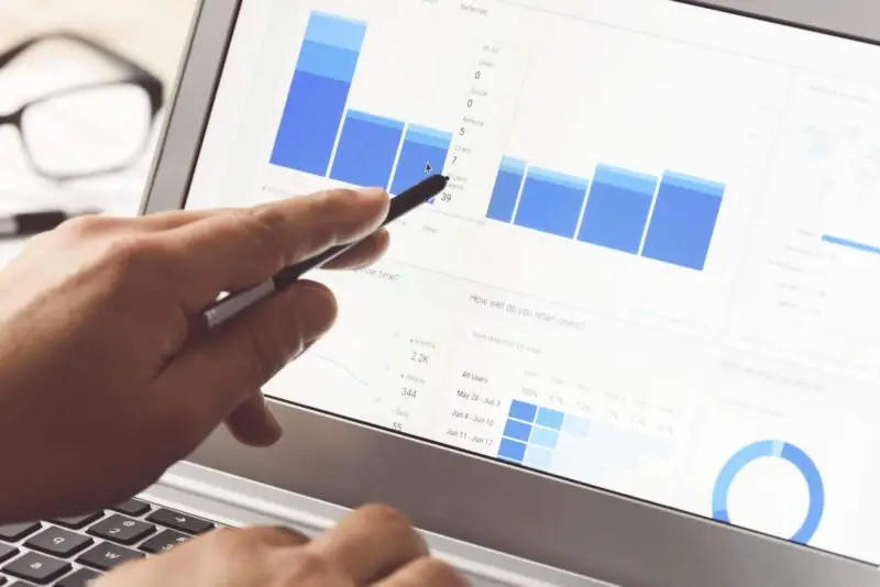
The proof is in the conversion pudding. According to Hubspot, these types of pages without navigational links had anywhere from a 16% – 28% increase in conversion.
We sure like that math.
The only clickable item on your sales page should be the buy button.

Sales pages create an emotional experience—use typography to help convey your emotions through design
Whatever your English teacher told you about writing essays—throw it out the window! Whatever they said about the number of sentences per paragraph or using bold and italics, or using slang—you have our permission to break ALL of those rules for your sales page.
As we wrote recently, a sales page is a sales conversation in digital form. Let’s say you wanted to tell your friend about the ahhh-mahh-zing yellow scarf you just bought—because you just know she’d like one too. Would you offer her a five-paragraph essay about the benefits of the scarf?
No, you wouldn’t. Instead you’d text her something like,
“OMG I just bought the most GORGEOUS yellow scarf! You neeeeeeeeeeed to get one, it would look so good on you and it’s so soft! It would look incredible with that blue sweater you just got! 😍😍😍”
While your English teacher is fainting from the slang and incorrect spelling… your friend is obviously going to feel like, “Wow, she’s so excited about this scarf! I need to see it!”
Bolding and italicizing text, writing one-sentence paragraphs, throwing in some slang, and inserting fun emojis all do something critical for your sales page…
…they stop the scroll.
All of those things are eye-catching. And on a long sales page, you want certain text and information to really jump out at your reader, so they stop and read the important parts.
So feel free to bold words in the middle of your sentence like we just did right there. Because it creates emotion, urgency, and excitement in your copy (see what I did there, italic causes you to read words in a fun way too!).

Sales pages have a different visual layout
Sales pages are typically much, much longer than website pages. There’s more copy, and that copy has to be given space to “breathe” visually. So for right now, let’s talk about that copy.
As you’re writing your sales page copy, you want to group similar ideas together. What’s the best way to group the information so the ideas build on each other? Most sales pages follow roughly this format:
- Briefly describe the service with a strong impact statement at the top of the page. This is a single sentence that describes who it’s for, what it does, and the exciting outcome they get from your service.
- Then, talk about why your product/service is the solution. This is less about features and more about showing you understand your customer’s situation. Oftentimes, this section is labeled as “pain points” yet leading from a place of service and empathy can be stronger than playing off of someone’s pain and fear. (Copywriting tip: Ash Ambirge has a simple formula for this. “You know how you keep trying to [do something] but [this other thing] keeps happening? Let’s work together to address it.”)
- Now that they realize you can solve their problem, talk about your service and how it solves their problem. (Copywriting tip: write from a perspective of how excited your customer will feel to solve their problem!)
- Call to Action #1 – appeal to them with many affirming yeses.
- Include a tangible image of your product/service with mock-ups.
- Tell them what’s included in your service—allll the nitty-gritty details.
- What are you (your company’s) credentials? Why should you be trusted?
- Call to Action #2 – appeal to them resulting in an aha (emotional appeal).
- Client Stories Before/After – Transformations – Testimonials
- FAQs – Answer the questions that are holding them back, that they need to know, and that will calm the nerves. Often, stats can be helpful here, too!
- Include a section about who your service is for…and who this is not for. Maybe some people are too advanced to need it. But also, don’t be afraid to describe the kind of person you wouldn’t want to work with. You have probably seen this as a side-by-side table so people can easily compare.
- Call to Action #3 – appeal to them with clear objectives and bullets (logical outline).
- The next-to last section should be about the specific outcomes they’ll get from buying from you.
- For the final section, sum up your offer in one single sentence and close with a call to action to buy.
Like we said—there’s a lot of copy here! There’s a raging debate in marketing about whether short or long sales pages work best. The truth is that you need to test what works best for your service—after all, marketing is experimenting! We recommend starting with a longer page (that fully answers your customer’s questions) first.
Then, when it’s time to design the page, you want to visually demarcate the sections by using alternating backgrounds (say, some backgrounds are white, another has a photo, etc.) or even horizontal lines.
NOTE: Using H2 and H3 text at the top of each section helps with SEO for the page (if you want it) and to summarize what your customer will find inside that section. You also want to be mindful of any ADA guidelines when selecting colors and determining if putting text on top of a photo is legible to everyone!
Design your sales page for success
While marketing is a seemingly never-ending cycle of experiments, we have a few final tips for you as you jump into designing your sales page.
- Oh, videos – They are fun, they can showcase personality, however… be sure that the quality of your video matches the quality of design on the page (both should match the quality of your product and price point, too). Also, watch your length… after about 60 seconds, visitors tend to finish the video and then want to put their phone down or go to a completely different topic (aka leave your page and not buy – BOO!)
- Warning: I’m about to use a word that is wayy too overused in the marketing industry. Be authentic—and before you roll your eyes, just think about this as being HUMAN. Have a heart, think like your audience, and speak to them as you would want to be spoken to.
- Design Inclusively – this is such a broad tip, but it’s so important to be sure you are designing for everything inside of this umbrella. Does your page convey your message to those with impairments? To those of different backgrounds as you? To those on a variety of devices and platforms? To straight-up any person that could be in your target market?
At Marketing Queen, we love designing sales pages on WordPress websites! Get in touch with us if you’d like some help with designing your sales page for aesthetics and conversion.
Did you enjoy this blog post? Pin it for later!