I think we can all agree that your website is a digital representation of your business. It should be easy to navigate, have plenty of content, and leave visitors feeling informed about what you offer.
Here’s the thing, a lot of websites are not as accessible to the masses as they could be. When this happens, it is easy to fall for the trap of just installing an accessibility plugin on the site and calling it a job well done. This is problematic because most website accessibility plugins only help on a superficial level.
This is why we need to have a comprehensive understanding of what website accessibility really means. The concept of website accessibility is spelled out quite clearly in the Web Content Accessibility Guidelines (WCAG). These standards are put forth by the World Wide Web Consortium (W3C).
Shoutout to Ilana Davis, a Shopify Superhero, with this helpful article to really answer the question, “Does your website have to be compliant with ADA?”. She is the best, and has enlightened me to incorporate these guidelines as a standard in the website’s that I build.
These standards ensure that people with disabilities such as blindness, low vision, color-blindness, or deafness can access your site using a keyboard, screen reader, or other assistive technologies.
Enabling these visitors to understand all of the information on your pages begins with the foundational structure of the site. It cannot be entirely dependent on a superficial layer provided by a simple plugin.
NOTE: This blog post was updated in January of 2025!
How Accessibility Plugins Work
Accessibility plugins add features to the front-end of a website (the part your site visitors see). The key thing to understand is that we are adding a layer of features.
A lot of these plugins add a visual control panel for your visitors to click on. The options allows a user to adjust the text size, contrast, and so forth. This is valuable for some visitors, as not everyone needs assistive technologies. Some simply need the ability to improve the contrast for example.
However, when a site visitor is using assistive technology or features inherently built into their operating system, this layer could be pretty pointless for them.
A False Sense of Accessibility with Plugins
Only adding an accessibility control panel to your website can be helpful. Yet, it shouldn’t leave you feeling like you’ve checked the box on making your website accessible.
There are so many facets of accessibility, and most need to be manually adjusted, inputted, and maintained by a human.
While we could get into examples involving redundant code, confusing styling settings, and more, let’s pull out one primary example of what the plugins do not do well – content!
We all want visitors on our websites to read our content and engage with our brand in some way. If the delivery of that content is unclear or inaccessible to some viewers, what’s. the. point.
The accessibility plugins provide visual options to a user. The options typically don’t touch your content, meaning the content itself is not altered for accessibility. Visitors can only digest and interpret content that is being presented to them. If a visitor listens to the content of your website with a screen reader, are they getting ALL of your content and context cues?
If you’ve read my posts on the importance of alt text and aria labels, you know that there is content needed “between the lines” in order to be interpreted correctly by assistive technology. Those that cannot visually see your design elements might require auditory cues as to what content is being presented.
Accessibility plugins will not automatically add these cues for you. It’s up to you, as the content creator, to do so.
The Accessibility Plugin Called One Click
If you feel you have built a great site with structural considerations for accessibility, and that you are practicing good habits in inclusivity when it comes to your content calendar, then maybe adding an accessibility plugin can be the cherry on top of your sundae. MAYBE! Depends on the plugin…
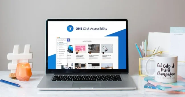
I have used the accessibility plugin called One Click, which is great for a superficial level of accessibility, such as the front-end website controls and features we discussed earlier. It also plays super well in the sandbox with Elementor Builder.
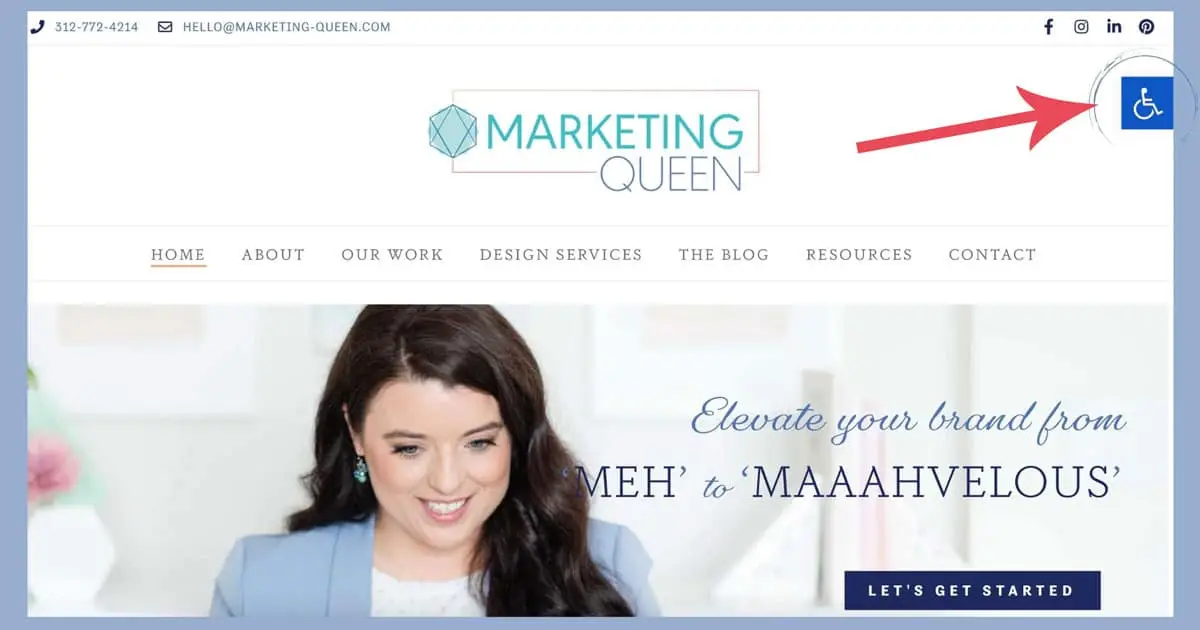
One Click will add a small icon (a wheelchair symbol on our website) to the right or left of the page. When clicked users to access a customizable toolbar with features like font size, color and contrast, readable fonts, link underlines, and more. However, with technology ever-changing and tools ever-changing… it is your responsibility as the website owner to be sure everyone is playing well together. We do not want to inhibit the tools used by certain users with another superficial tool.
Be sure to watch out for claims made by various plugins. For instance, you might take a look at this FTC Press Release from January of 2025… click here to read it!
The Moment of Truth… Testing Your Website
This is where testing comes into play, the best way to test your website for accessibility is to use a screen reader yourself. For example, try to navigate your website without using your mouse.
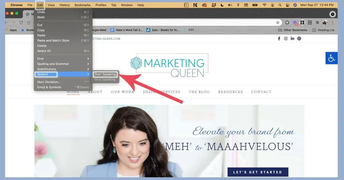
You can also get Google Chrome to read a webpage to you by clicking ‘edit’ – ‘speech’ – ‘start speaking’ to see how your website will respond to someone who is using dictation software.
Additionally, W3.org provides a long list of different tools you can use to test your website accessibility, such as a contrast accessibility validator, an A11y site checker, and more.
There’s no reason your website can’t be accessible! Yet, website owners need to be aware of any ‘solution’ that is a one-click addition to your site. If it doesn’t touch your content nor the structure of your site, it’s probably a superficial layer.
Learn More About Adding Accessibility to Your Site
Interested in learning more and staying up to date on accessibility tools, techniques, and more – I’m always on the hunt for more and more resources, but an account I have followed for quite some time would be Erin on IG (@mabely_q) – be sure to follow here and check out her website: https://www.mabelyq.com/accessibility-tools-apps
Enjoy this post? Pin it for later…
For help pinning these graphics – here’s a helpful link!
