Does your website need to be accessible for people with disabilities? Since December of 2008, the answer has been “yes.” But in late 2019, the Supreme Court made a move to change that “yes” to a “YES!” (See what I did there?)
ICYMI: Several years ago, a blind man wanted to order Domino’s Pizza through the company’s website. But he couldn’t, because their website wasn’t compliant with the American Disabilities Act (ADA). He sued them and won. When Domino’s appealed the decision to the Supreme Court, the justices chose not to hear the case of Domino’s Pizza vs. Robles – letting the lower court’s decision stand: blind people can sue retailers if their websites are not accessible.
What does this mean for you and your website? If you sell goods or services online, you could be successfully sued for not making your website ADA compliant.
Getting sued obviously means a loss of revenue. But it’s more than that. As my colleague Ilana Davis has blogged, “When you ignore accessibility, you are ignoring revenue!” And profitability aside, it just makes sense to be inclusive of everyone in your target audience, whether or not they have a disability.
Marketing Queen Consulting is committed to ensuring digital accessibility for people with disabilities for our own website and for our clients. We are continually improving the user experience for everyone, and applying the relevant accessibility standards.
Get to Know the Web Accessibility Guidelines
The first step to an ADA-compliant website is to get to know the Web Content Accessibility Guidelines (WCAG) 2.1. We’ve linked to the full text of the guidelines, which are long and detailed because they are a technical standard.
So, we suggest looking at the Examples of Web Accessibility put together by the World Wide Web Consortium, or W3. W3 is an international community of members, staff, and the public that develop Web standards. It defines three levels of conformance: Level A, Level AA, and Level AAA. The Examples of Web Accessibility covers 3 basics: alternative text for images, keyboard input, and transcripts. The examples are a great introduction to the kinds of information needed for web accessibility.
Marketing Queen Consulting’s website is partially conformant with WCAG 2.1 level AA. Partially conformant means that some parts of the content do not fully conform to the accessibility standard.
Our efforts include:
- Font Size and Font Family – we make it a habit to use REM sizing for text, meaning it is relative to the base font size that a user has set up on their own monitor.
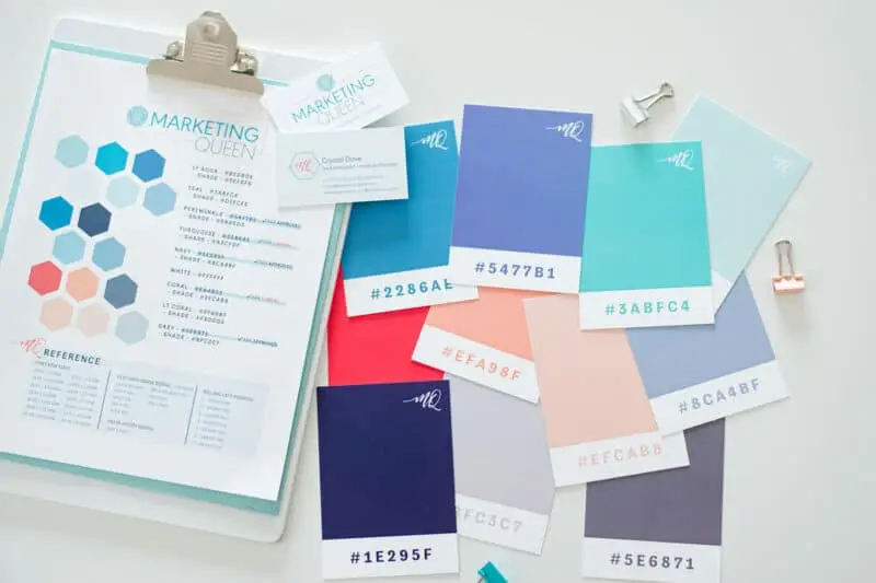
- Proper Color Contrast – we do our best to ensure legible text with appropriate color ratios (think text color on colored backgrounds). This mathematical ratio helps us to know what text is really clear for everyone. (See example color chart below – some combinations pass AA compliance, some AAA, and some do not pass. You’ll also see a yellow approval which means that it can be used if the text is large and chunky (3+REM))
- Image ALT Attributes – we include descriptions of our content imagery so that folks who can’t see the image will know what we’ve included on our pages.
- ARIA-Labels – we have added key values to a majority of our links that clearly explain to the visually-impaired what clicking on the button will do.
- Installing and Enabling the One Click Accessibility Plugin – a clean plugin that offers various adaptations that users can turn on or off.
Use a WordPress Theme That Has Accessibility Baked In
We love and use the Elementor Hello Theme, and a few other major themes that use the Elementor plugin for the websites we’re developing right now! It has built-in functionality that specifically makes websites more usable for people with visual impairment.
We recommend reading this article from the Elementor website to learn about the key changes to make for accessibility.
One of the best things about WordPress is its opportunities for customization with plugins. The Elementor website suggests the One Click Accessibility plug-in (it’s free!). Just for example, it will add a toolbar to your site that allows a visitor to resize the font, make grayscale images, and change the contrast of the background and text.
Have an Accessibility Statement on Your Website
In addition to having a Privacy Policy and Terms of Use on your website, you want to have an Accessibility Statement on your site too. It shows your site visitors two very important things:
- You acknowledge the need for accessible content.
- You are committed to making sure your content stays accessible to your audience.
So what should you write for your Accessibility Statement? Once again, W3C is here to help! They provide a statement generator on their website that allows you to generate both a minimal and a complete statement.
For examples, check out Miami restaurant Three’s accessibility statement page, and of course, you can check out the Marketing Queen accessibility statement. Both websites link to the statements in the footer navigation.
The Final Word on Website Accessibility
With all of these tools available, it’s easier than you might think to make your website accessible for people with disabilities. Of course, this isn’t legal advice, so if you have concerns you should consult with your attorney.
